RingConn
Client
RingConn
Scope
Branding
Industry
Tech
Year
2026
The Project
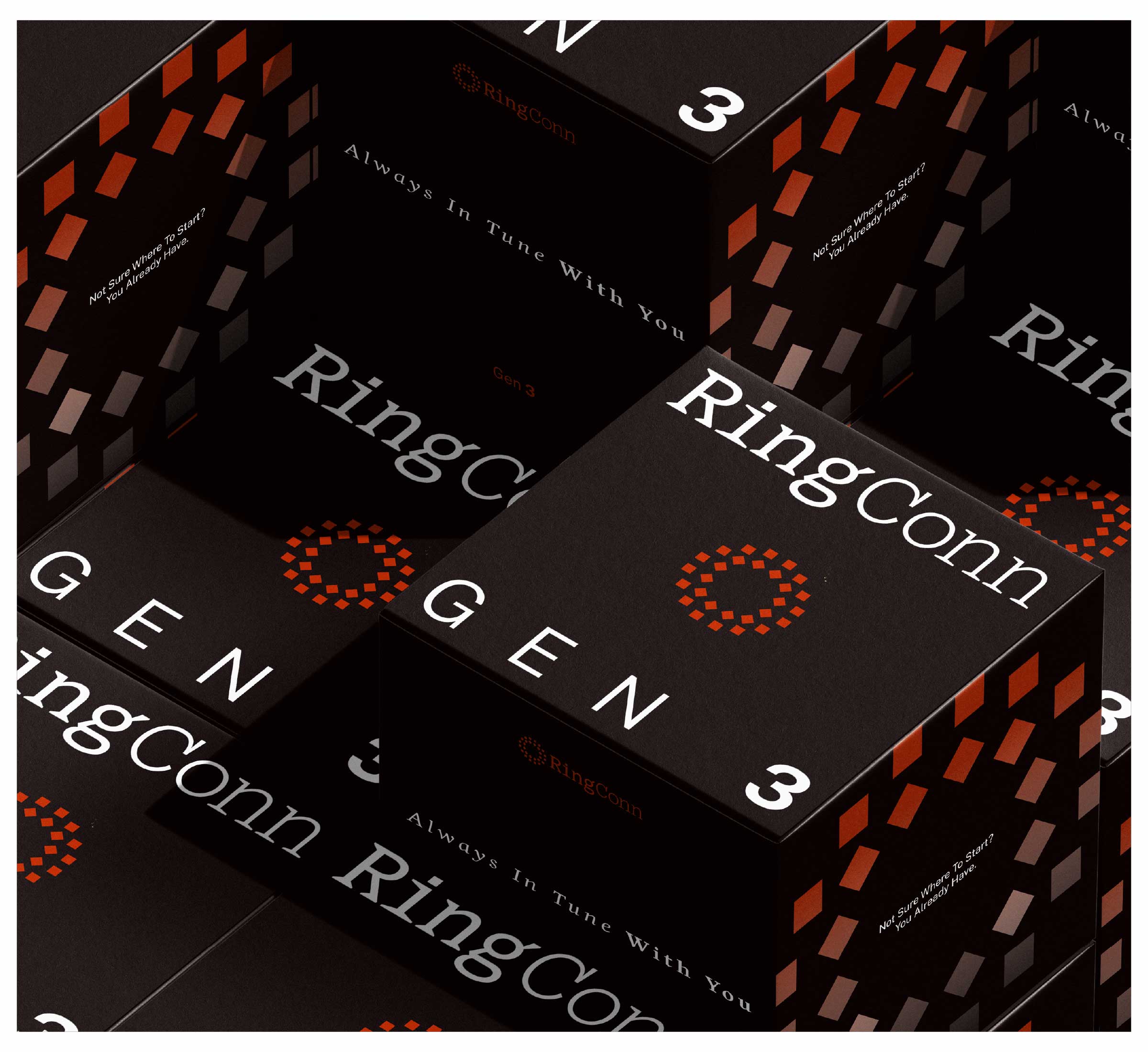
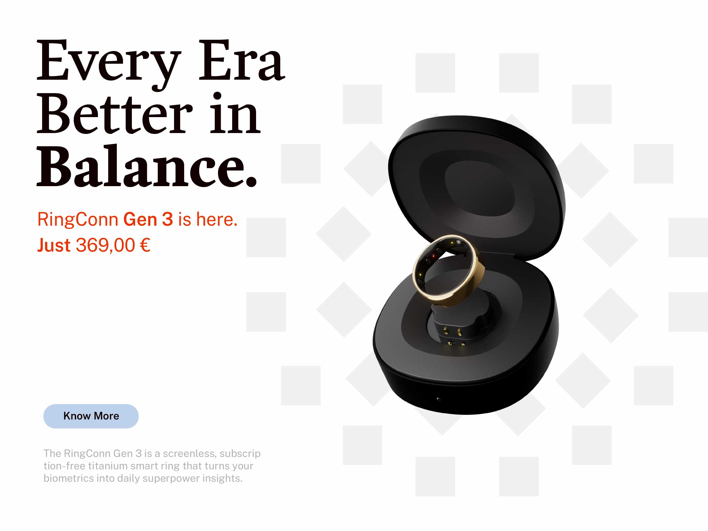
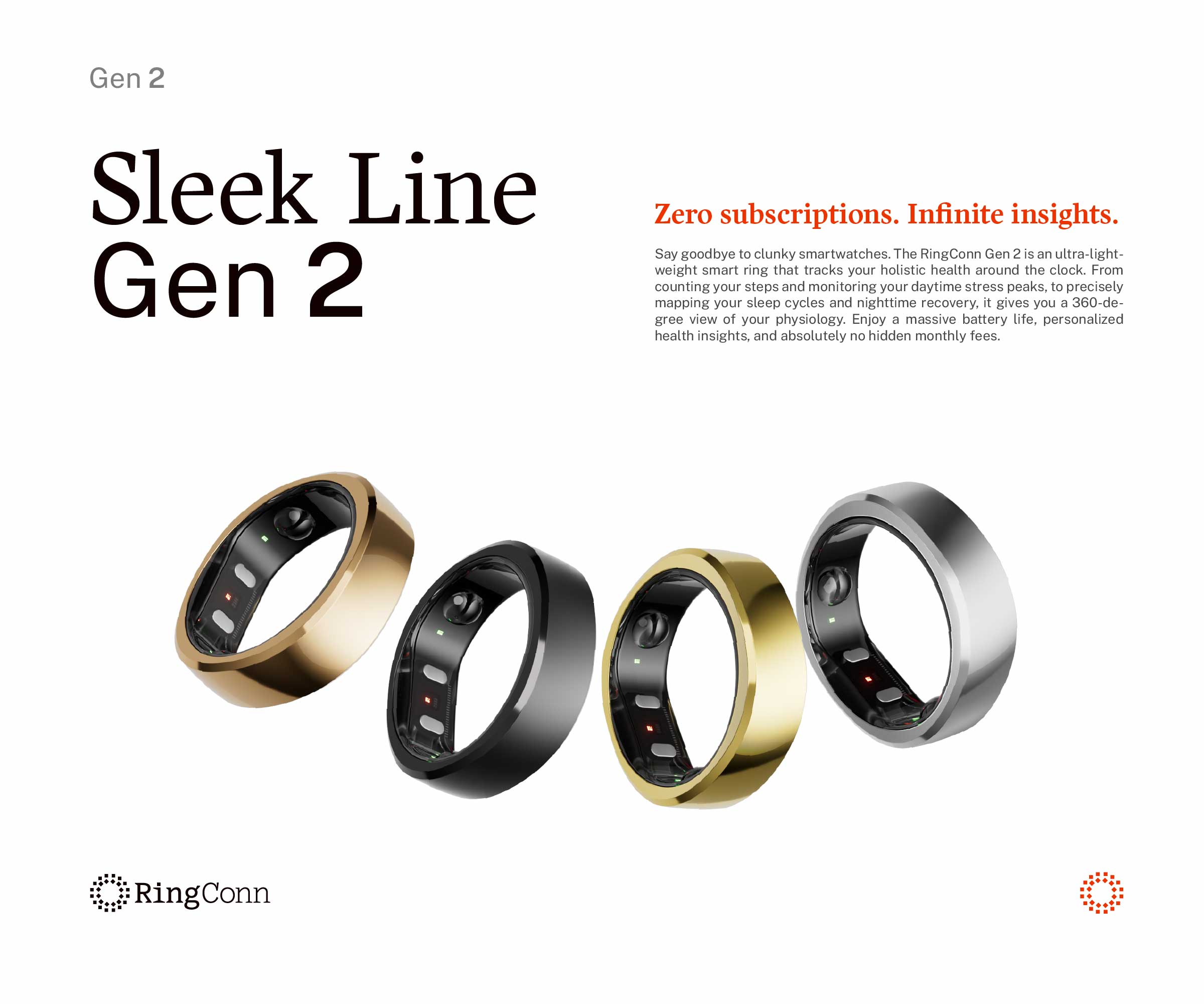
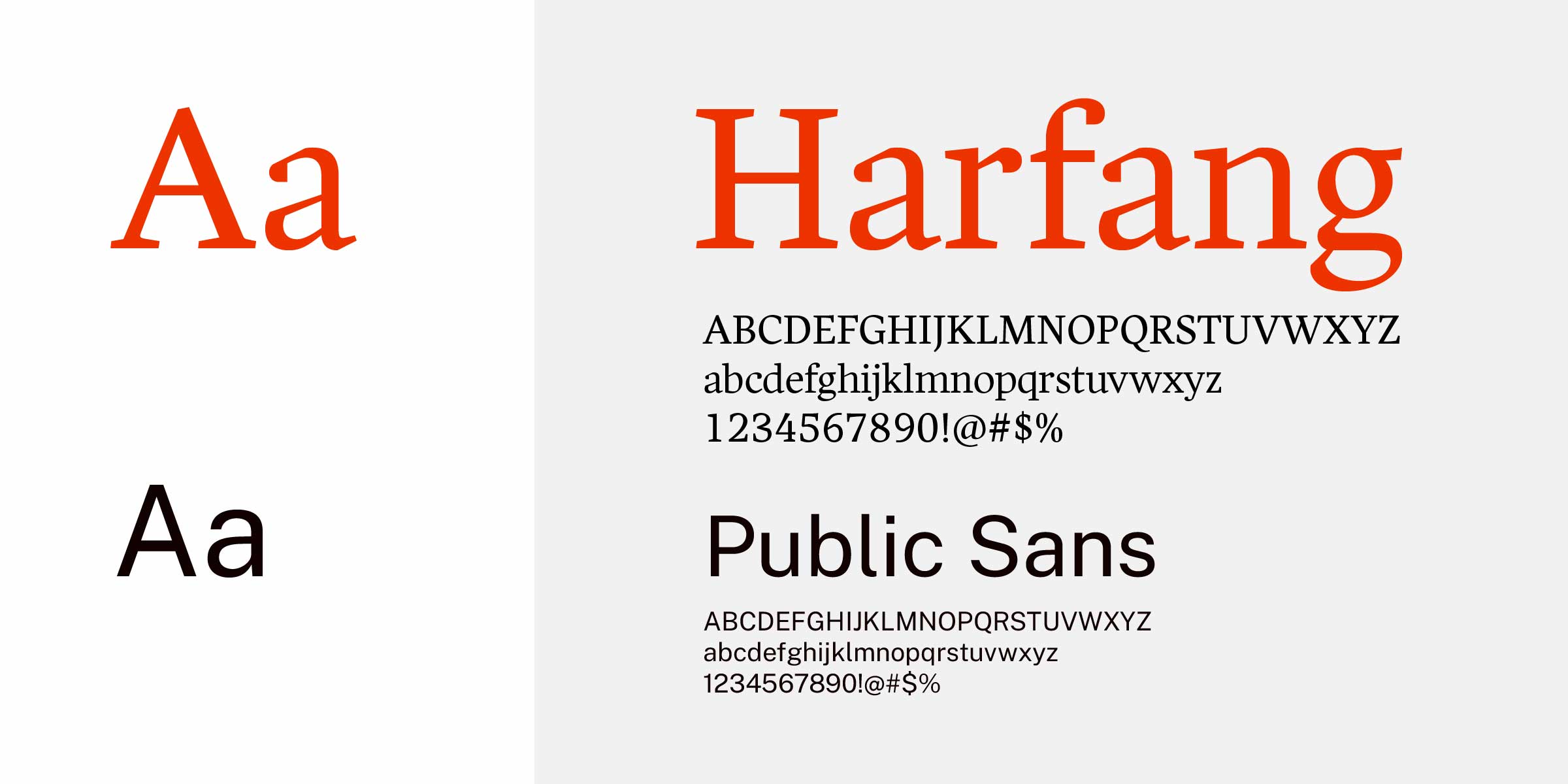
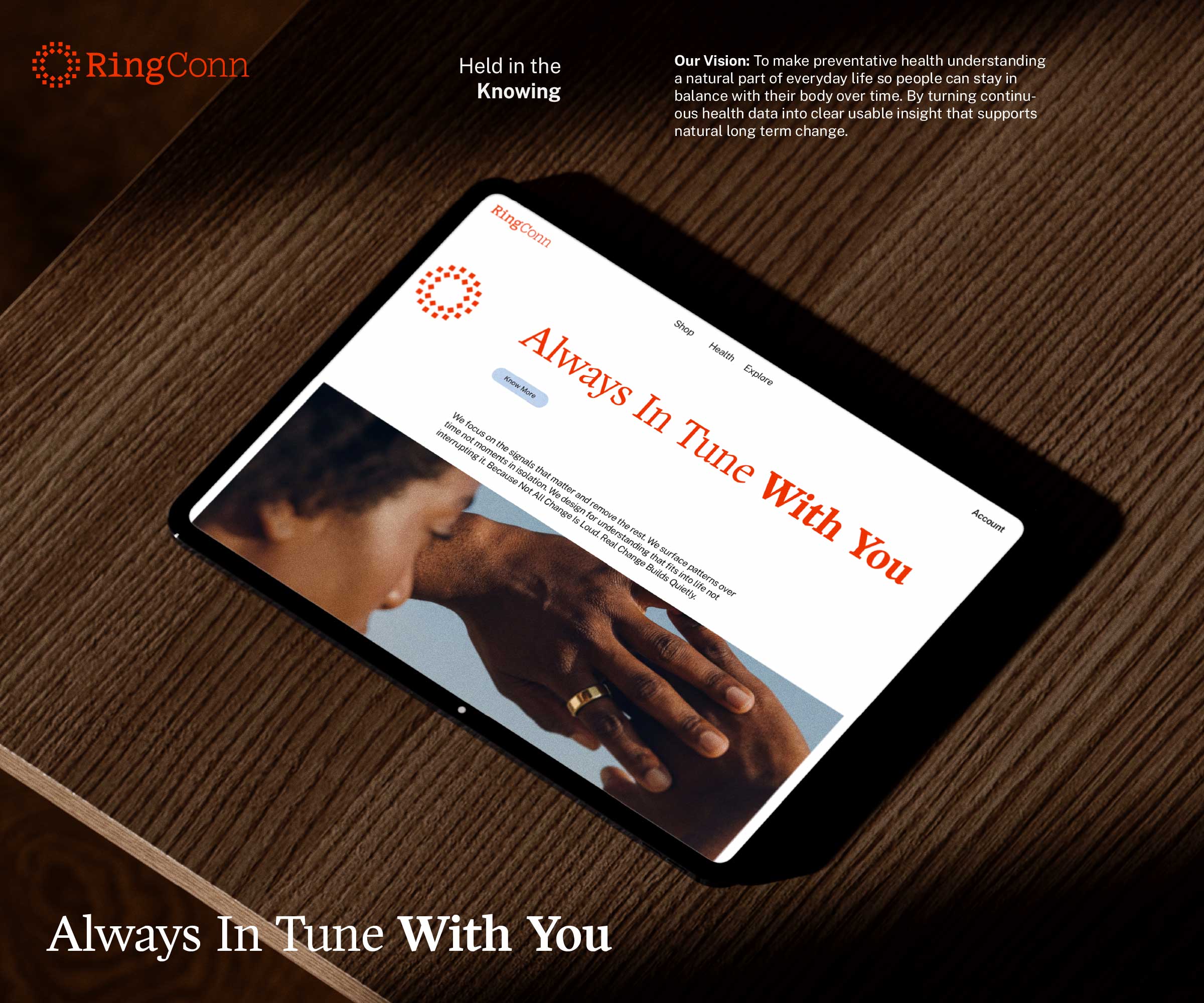
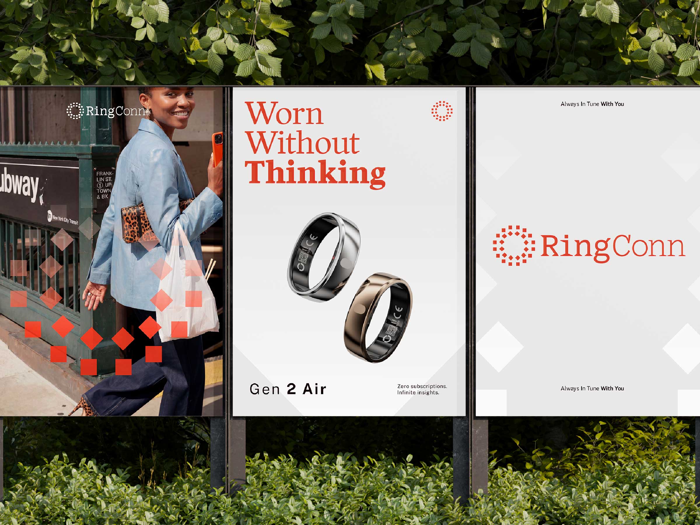
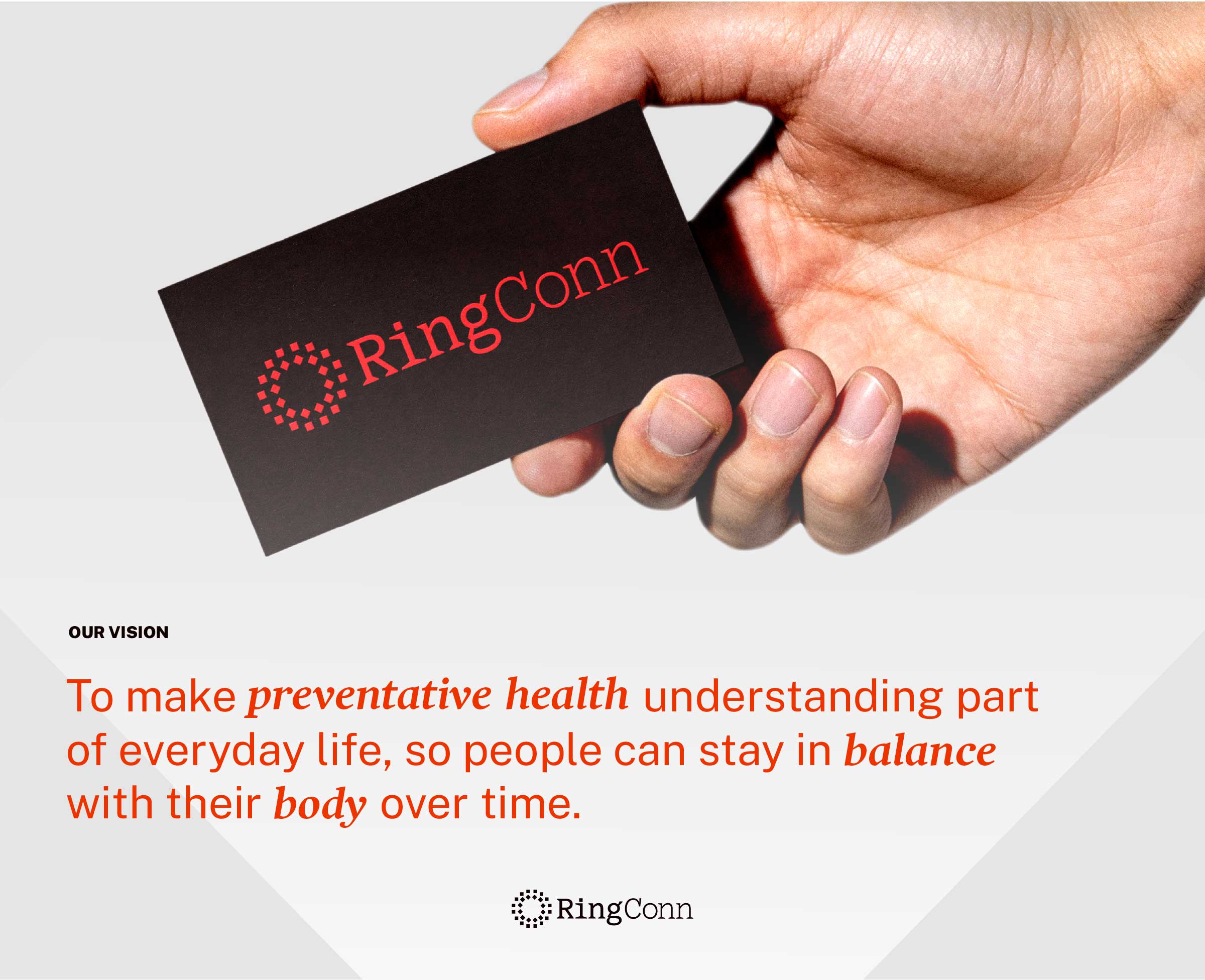
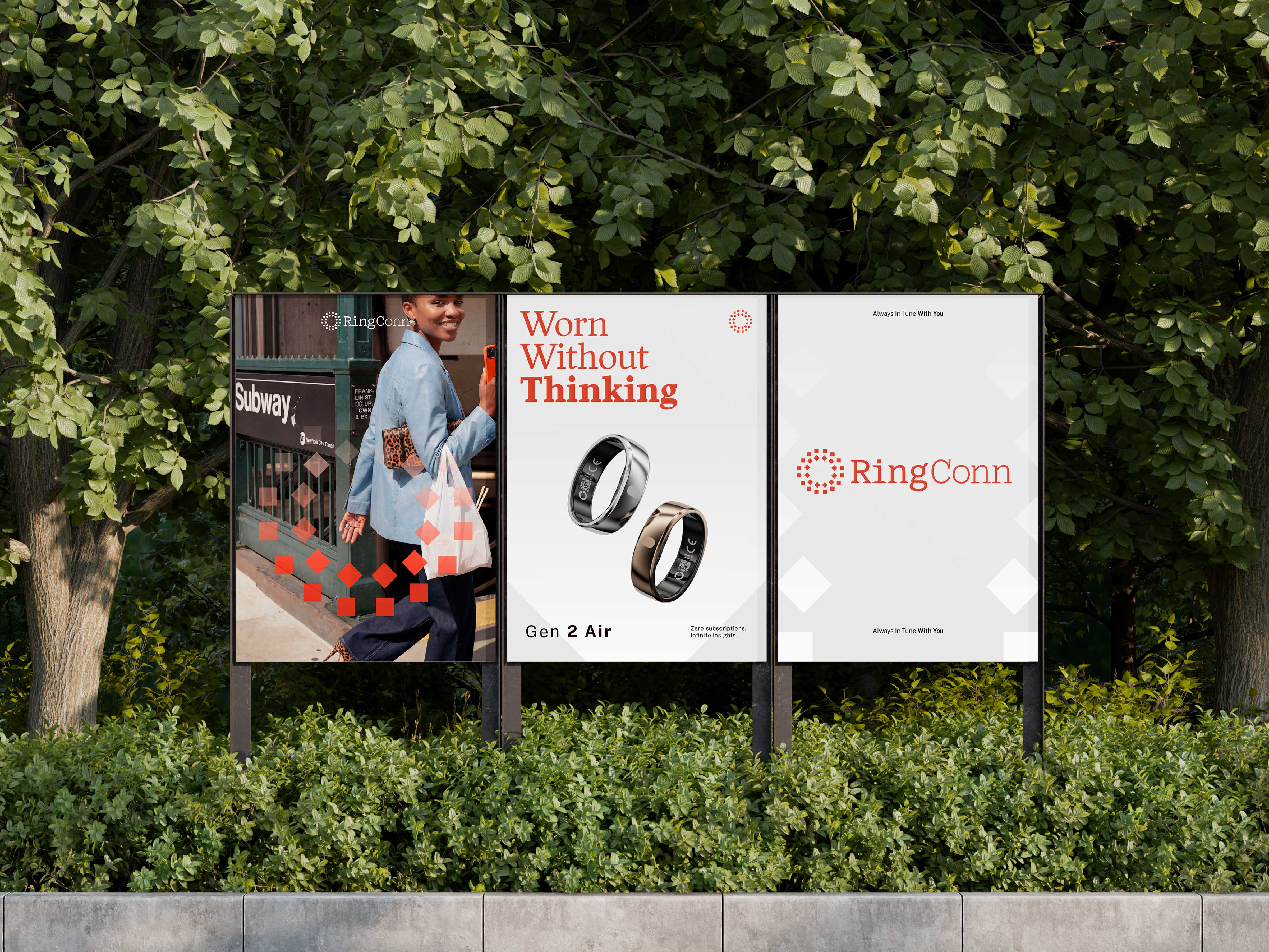
RingConn is one of only three major smart ring brands. Before partnering with us, they were positioned as the cheap alternative. After our brand strategy, we repositioned them as the perfect companion for people’s health. At the core of RingConn’s identity are these key values: human-first, natural, warm, and trust. These elements resonate throughout the brand's communication. We built on these keywords to create an aesthetic that focuses on simplicity—shifting the focus from tech to humans—using a warm orange as a highlight color, a serif font to humanize the brand, and a logo that focuses on the representation of the ring and data.
The Details
To capitalize on an unsaturated market, we avoided the aesthetics of our competitors and chose a color that would make us stand out: orange. Our creative direction utilized AI-generated imagery to depict our strategic target audience in a relatable light, showcasing busy people capturing real, everyday moments. The entire project was developed by another strategist and myself.